ShopDreamUp AI ArtDreamUp

Deviation Actions


Description
Long time no see u!
This is a cursed painting, the kind that at first, in a couple of hours, they promise a lot, and then , are getting worse with every extra hour u spended on it, so I had to give up and finish it.
I didn´t care so much at the moment,because im busy with a project that im very excited about it.
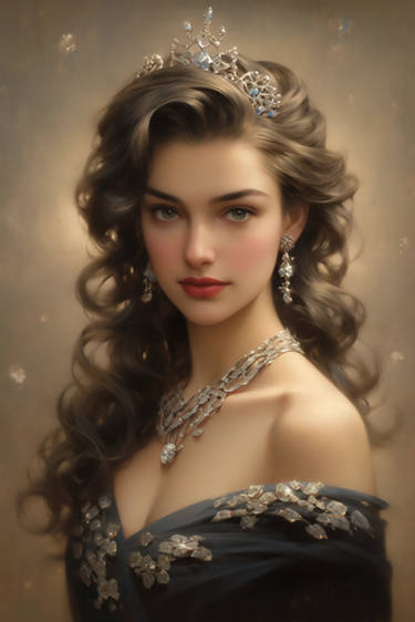
This was originally done for the ImagineFx Cover challenge,but i wasn´t able to finish it at time.I wanted a Valentine´s day mood,with a beautiful dolly girl,and the face is a reworked version of "Persephone",my previous work.
Credits:
reference for the pose from almudena-stock.deviantart.com/
Hearts brushes from torpedo-design.deviantart.com/ and mcbadshoes.deviantart.com/
Done mainly in photoshop cs3,with little help of painter 11.
Comments and critics are very welcome.
I Hope u like it,See you (Smile)")
UPDATE:Now avaible a full tutorial of this piece on CGArena magazine here
Selected for Exposé 8!
This is a cursed painting, the kind that at first, in a couple of hours, they promise a lot, and then , are getting worse with every extra hour u spended on it, so I had to give up and finish it.
I didn´t care so much at the moment,because im busy with a project that im very excited about it.
This was originally done for the ImagineFx Cover challenge,but i wasn´t able to finish it at time.I wanted a Valentine´s day mood,with a beautiful dolly girl,and the face is a reworked version of "Persephone",my previous work.
Credits:
reference for the pose from almudena-stock.deviantart.com/
Hearts brushes from torpedo-design.deviantart.com/ and mcbadshoes.deviantart.com/
Done mainly in photoshop cs3,with little help of painter 11.
Comments and critics are very welcome.
I Hope u like it,See you
UPDATE:Now avaible a full tutorial of this piece on CGArena magazine here
Selected for Exposé 8!
Image size
833x1200px 705.49 KB
© 2010 - 2024 OmarDiazArt
Comments206
Join the community to add your comment. Already a deviant? Log In
It really is a good piece, strong and impressive through the many details you cared to draw from the background all the way to those lovely hair curls.
I can say a whole lot in the "what i like" category but so little in the other one, there for i'll start with the cons.
Cons: - her medallion is a little bit to sharp, most of this piece is suggested and not many things are sharped and detailed but that medallion sticks out a little bit to much, you should probably blur it a bit or something.
- the signature should have been on the lower left side and not on the right because there you have a lot of red and space to put the signature ... and because of the effect you put on the signature on that red spot the writing would have a more uniform color but in it's current position it changes color way to abrupt
-title and vision are a bit irrelevant, it does speak of love and the desire of said feeling + plus valentines day ... but on that line it's not very original and it doesn't show you that feeling through an original way.
Pros:
- good technique
- good choice of colors
- good proportions
- good lighting
(ok you got the point ... i'll stop here)
Bottom line : it's a very wonderful piece, very few mistakes, actually almost none ... the ones i said were just personal preferences of mine.
Second bottom line : good job and keep up the damn good work <img src="e.deviantart.net/emoticons/s/s…" width="15" height="15" alt="